What to do with the Blank Space Above your Sofa
Apr 26, 2024
image above: Quill Decor
This post includes affiliate links. If you make a purchase after clicking on a product in this article, I may earn a commission, without affecting the product's price for you. Thank you for supporting my small business! 💗
Is the sofa in your Airbnb's living room in front of a big blank wall? A blank wall always seems to grow and become more boring once the sofa is positioned in front of it, right? It can be overwhelming knowing what to do with this prominent blank canvas.
But... What if I told you that this is actually the perfect opportunity to inject some style and artistic flair into your short-term rental? There are a lot of different ways to bring that wall to life, and I'm here to help by showing you exactly what to do with the blank space above your sofa.
Let's break down the options and gather inspiration from some beautiful examples by some amazing designers.
Gallery Wall
Gallery walls are always fun and can really allow your creativity to soar with the endless options for what to add. They can be a great option if you're sticking to a tight budget as a few small pieces tend to be less expensive than buying one large piece of art. (But not always! It totally depends on how you approach it. Bringing together many thriftstore and Target finds, can equal a cute and inexpensive wall, but this will take TIME. So keep tabs on that.)
However, I totally get that the term "endless options" is enough to send most of us into a tizzy of anxiety, and I get it. I am the exact same way without a well-thought-through plan.
And listen, I want to say right here that you can cheat and order one of these ready-curated gallery wall sets from Etsy. If the idea of building your own bores you to tears or makes you feel crazy, don't sweat it!
But otherwise for those that want to learn about the art of the gallery wall, how about a mini-tutorial?! Let's dive in! First of all...
- Color Palette
The first thing to consider is your color palette for your overall space. Do you already have a palette in mind? If not, then start with this blog post. Having a tight and consistent color palette for your space will eliminate a lot of stress and give you the start to a road map for your endless decorating selections.
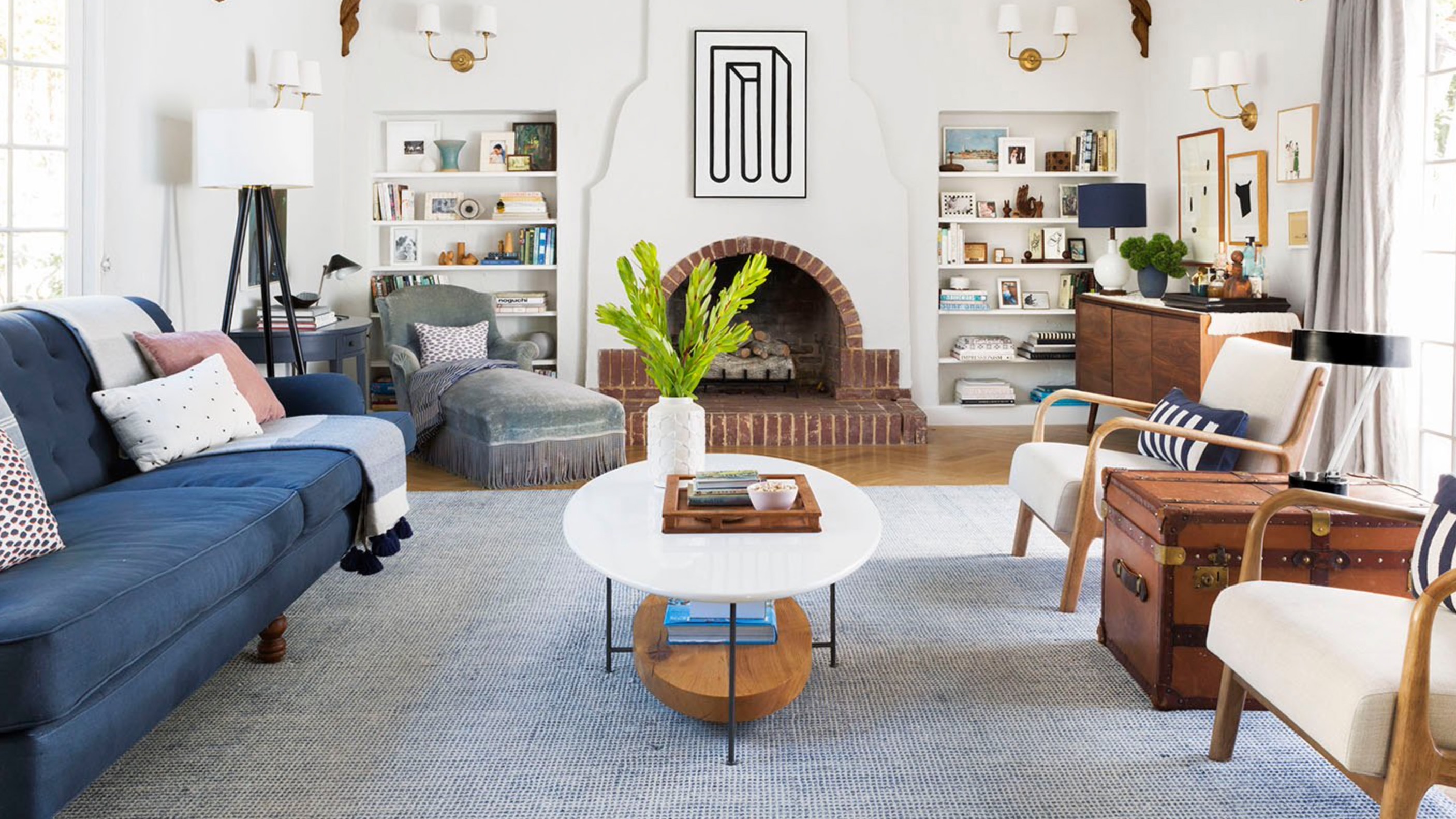
Emily Henderson, aka color play genius, is hands down one of my favorite designers, and I'll reference her work a lot to teach by example. In her design below, she repeats various shades of pink, blue, and yellow in all of the artwork, as well as the sofa and pillows beneath. You also see hints of green, but the color pops are predominately pink, blue, and yellow. You'll notice that she uses only white and natural wood frames, which makes this gallery feel cohesive but not too flat. (More on this later!)
 image above: Emily Henderson
- Placement
After color, you'll need to consider how much of your wall you'd like your collage to take up. Bigger is generally better when it comes to artwork for a pro look and a gallery wall is no exception. Ideally, you'll want to fill up at least 1/2, or even better, 2/3 of the wall above the sofa. You can see in the images below, that they exceeded the 2/3 rule and went for it by covering all the wall space. To some people, this may feel cluttered, and to others, it will feel invigorating. No matter what though, this place looks thoughtfully curated and unique, and for a rental that's a win.
Think through the overall shape you're going for. Here are a few tips to consider while planning your wall:
- If you're going for symmetry, be careful to measure and mark your wall to make sure you get it just right. On the other hand, if you're aiming for an asymmetrical design, don't be afraid to test things in a certain spot by putting a few extra holes in the wall as you go. It's easy to spackle and paint over a small hole, and chances are you may cover it with another frame by the time you're done, anyway!
- The spacing on an asymmetrical gallery wall does not need to be perfect. It's meant to be a little off, so don't overthink things. The inconsistent spacing helps your eyes move around and take it all in, so play around with what looks best on your wall.
- Creating the perfect wall for you may take some time. Have patience! The slower you acquire and collect, the more meaningful and interesting your wall will become. To ensure you're making good purchasing decisions and that everything will go well together, keep photos on your phone of the pieces you currently have. That way when you're strolling an open market on a Saturday with your best friend and you find something you think may work, you can be confident you're making a good decision by referencing your collection. Don't stress, and have fun with it!

image above: Anika Pannu
 image above: Studio Gild
As we discussed above, your gallery can take up the entire wall and have a lot of pieces, or it can be more simple and have some symmetry. It also can go just behind the sofa or go all the way to the ceiling for a feeling of grandeur. Your Airbnb is unique, so let your choice of artwork be unique too! You don't need to try and please every guest, you just need to be UNIQUE. That will stop the scroll and get people to push 'book'!
- Framing
In the gallery wall below there are thin modern frames, mixed with traditional beveled frames, mixed with round frames, and even no frames at all! Don't be afraid to mix and match! By sticking with a muted color scheme for the artwork, the designer has kept this look the right side of cohesive rather than cluttered, but don't be afraid to experiment.
If you're looking for a good online frame resource, here are some of my favorites: Framebridge; Art to Frames; Etsy.
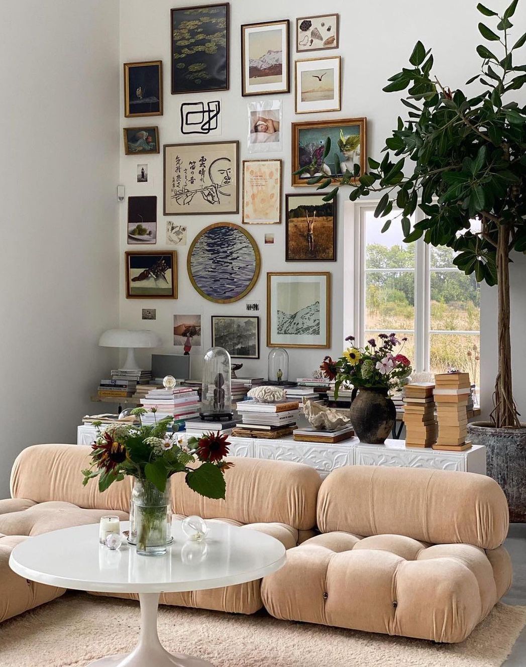 image above: Curated Interior
Wallpaper
I love wallpaper. You'll be hard-pressed to find a designer that doesn't. Follow me on Insta to see some of my fav wallpapers in play! Wallpaper can transform a space and it's also true that it can be an investment. BUT, it will instantly grab the attention of your potential guests. Tallpaper will be a room's focal point and will make you stand out from the crowd when your guests are scrolling through the app looking for the perfect Airbnb.
I love the look of art layered over wallpaper! I know, it can be scary! But it adds depth and interest and makes the art look more grounded and less like it's floating in a large abyss of painted drywall.
 image above: Amanda Nisbett
Even without any art, wallpaper has an almost magical ability to transform a space into something completely different than it was before. It gives the room a layer of depth and whimsy that can feel vibrant and alive.
Belarte Studio, pictured below, is just one design studio really pushing the boundaries of what can be achieved with wallpaper. I love how this statement light shade mirrors the shapes in the wood effect wallpaper behind it.
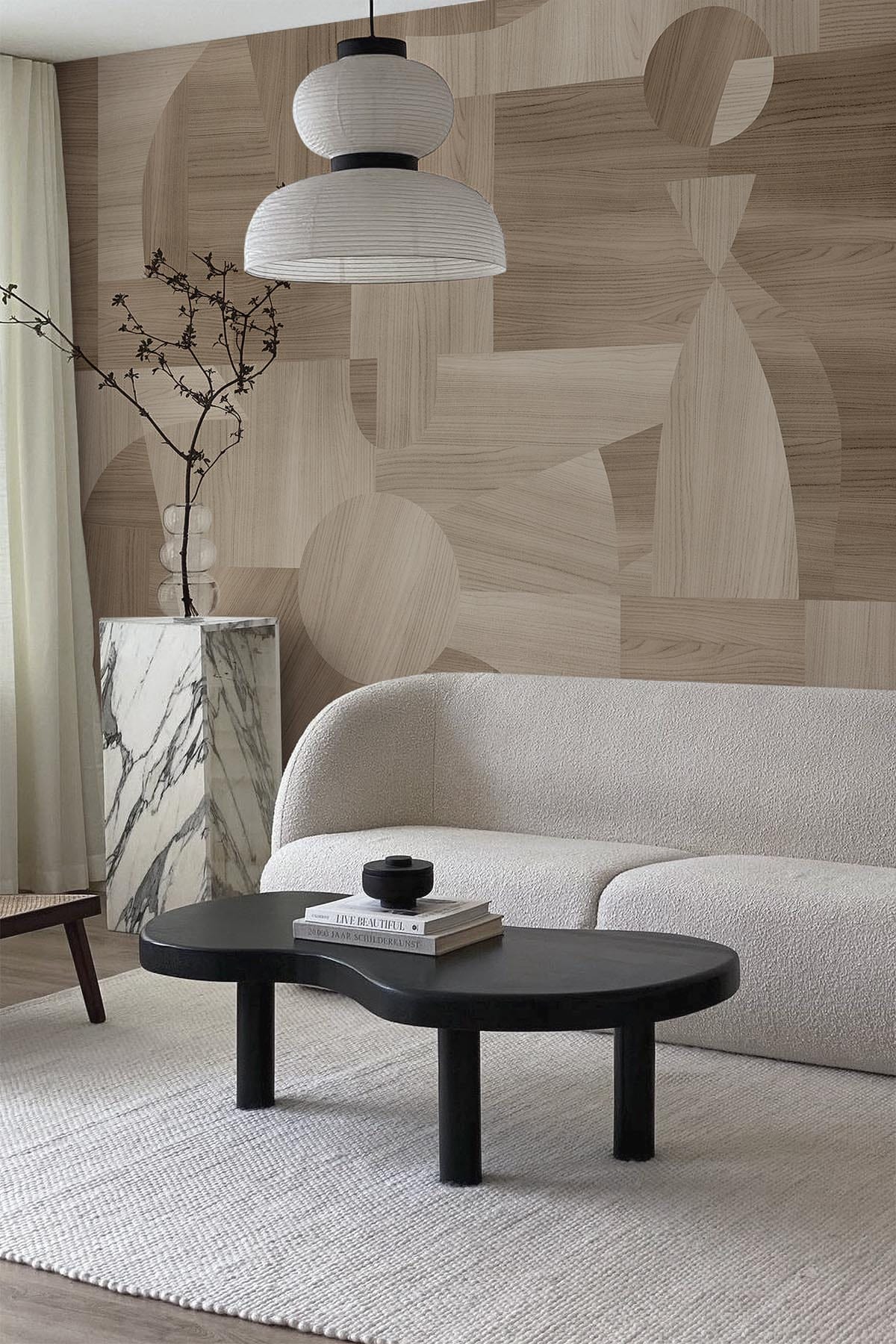
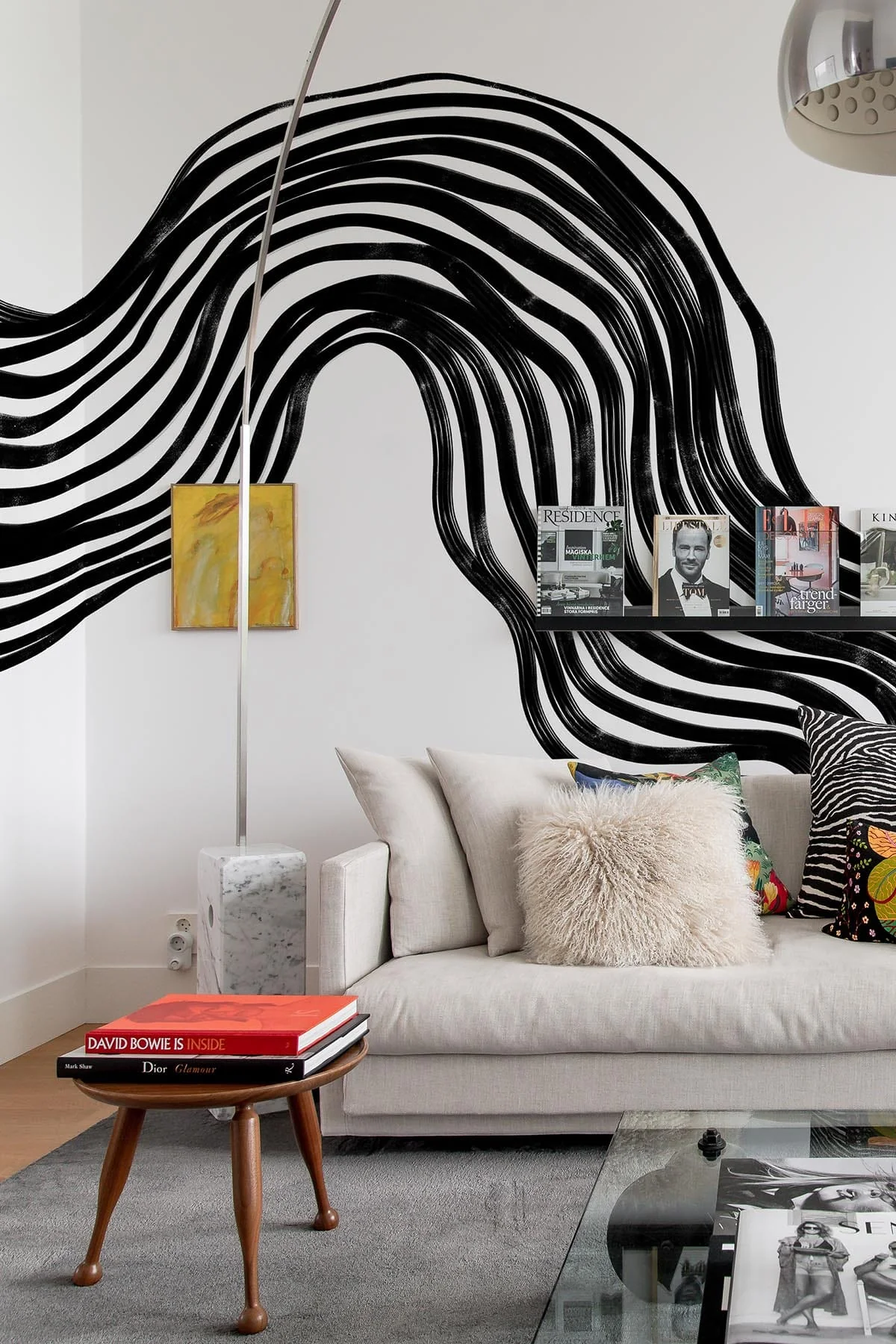 image above: Belarte Studio
Choosing one wallpaper may be more comfortable and less time consuming than choosing several pieces of art and deciding their placement. It's still a big decision though, so make sure and get a sample before you order your rolls!
Organic Shapes
If you're not inspired by pieces of framed art or wallpaper, then you could explore other forms of art to place on your wall. For example, these woven baskets add a touch of antiquity while pulling the outdoors in.
Golden rule: an odd number of items will always be more pleasing to the eye than an even number!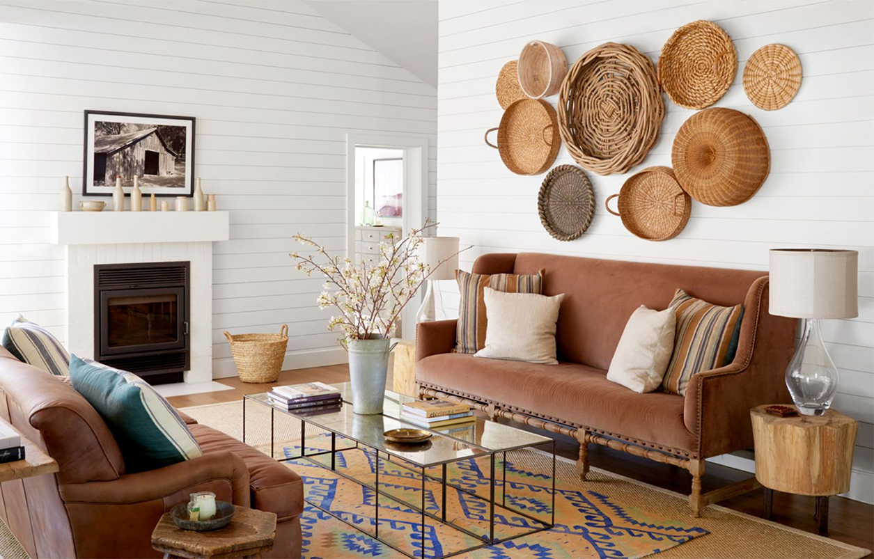 image above: Bonnie Miller via Country Living
I am OBSESSED with the mirror below. The organic shapes and mix of materials completely transform this room and create such a feeling of drama, without being overwhelming.
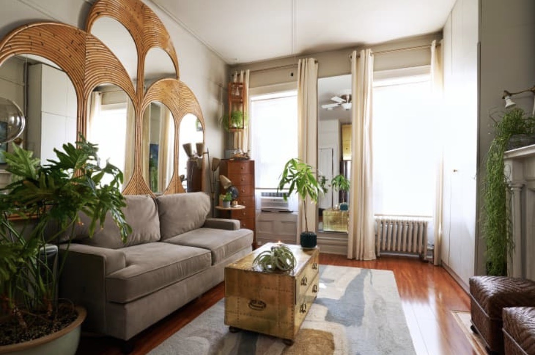 image above: Kim White Style
Other trendy organic objects to consider: macrame and tapestries.
 image above: Lazy Loft
Plants are also one of my favorite ways to (literally) add life to a space. They are all different which adds a bit of magic to the room. Think of them as little inexpensive sculptures! Search for unique shelves for your plants like in the image below (shop similar here), or you can hang them.
Adding live greenery works for any space, any style! Don't be afraid to kill a few along the way. Unintended plant murder is just a part of the journey toward a green thumb! And if plants don't make sense for your rental (very likely) then go for some fabulous faux options!
 image above: Kaekoo
Float Your Sofa
Depending on your living room's shape and layout, you could float your sofa in the room.
Placing your furniture in front of your window allows for natural light to spill in on the most used spot -- that comfy sofa. Psst... take a look at this blog if you need a hand choosing that oh-so-comfy sofa!
You can also incorporate fun curtains to add more interest, and intriguing art to the side if you still have some wall space to fill. I adore how Justina Blakeney styled this room: a table behind the sofa full of plants, deep teal curtains to draw your eye out, and a painting on the side that keeps your eye roaming around the room looking for more detail.
 image above: Justina Blakeney
In the living room below, the sofa is placed in the middle of the room so it's the first thing to greet you upon entering the space. The bold pop of color works so beautifully and the artwork and mirror beyond draw the eye the full length of the room.
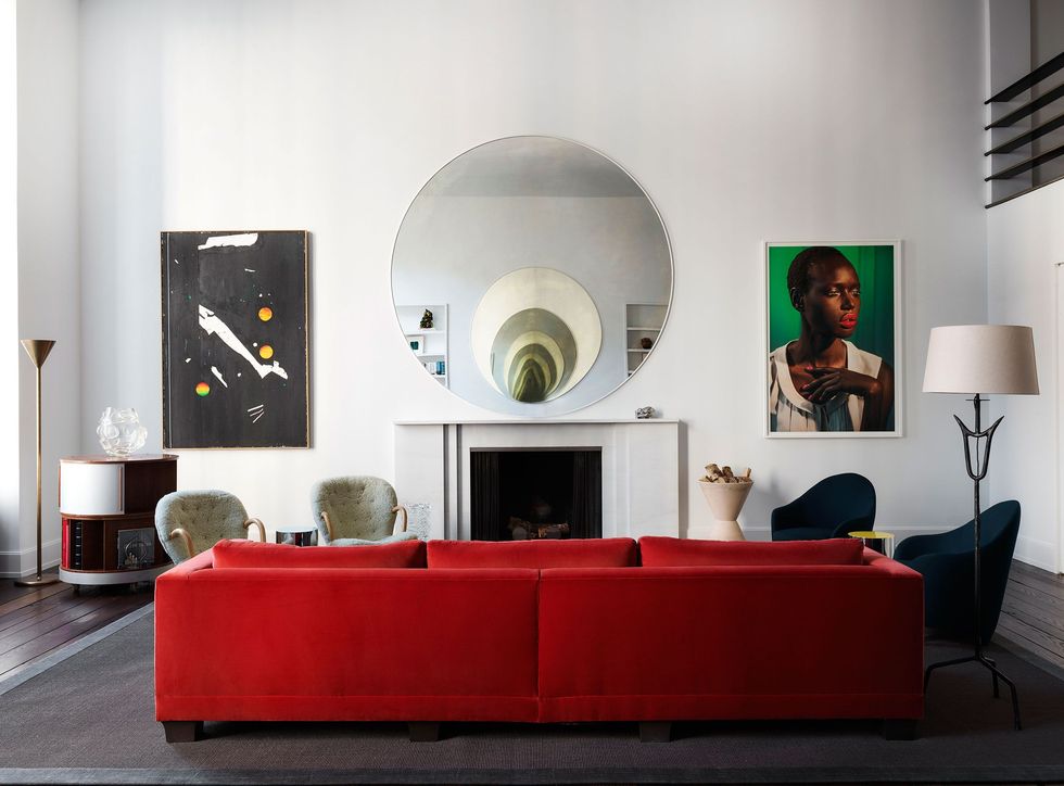 image above: Douglas Freidman
Floating Shelves
Floating shelves above a sofa can be a fun way to add personality... and more plants! There is nothing like a nice faux tree to help fill out the big blank wall! Check out how we did that in this Myrtle Beach rental.
A shelf can also be an uncomplicated way to display some cool art. Unlike the gallery wall, it takes less planning and fewer holes in the wall. It's simple and clean-lined for a more contemporary look.
 image above: Chris Loves Julia
 image above: Design by New Darlings
I hope this blog leaves you feeling a bit more inspired and a lot less overwhelmed. Good luck! And don't forget to tag me on IG to let me know how you're doing styling your big blank walls!
And if you think you'd like some more help on this topic, sign up for my Art Selection for Rentals Workshop! I've been building out this class to empower hosts to curate their properties with show-stopping art that won't break the bank. Click below to learn more!
Cheering you on all the way! XO


