A Beach Property With a Bold Design on a Budget - Part 1
May 26, 2023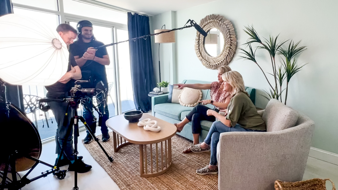
This post includes affiliate links. If you make a purchase after clicking on a product in this article, I may earn a commission, without affecting the product's price for you. Thank you for supporting my small business! 💗
You may have heard over on my Instagram that I recently headed to Myrtle Beach, South Carolina to revamp 3 condos in the span of just a few days with Stacey St. John for our show Better Your BNB.
(Better Your BNB is a weekly Youtube show where Stacey and I review one Airbnb property's listing and interiors in 10 minutes or less, giving the host 3 actionable takeaways to improve their business. Check out the latest episodes here!)
The fun part: we had a film crew with us at the beach documenting the entire thing into entertaining episodes of our Youtube show, where we will show you actual ways to Better Your BNB. The whole experience was truly a whirlwind, but an amazing lesson in what you can achieve in a small amount of time (and on a budget!) if you make a plan.
The makeover shows will take a few months to edit and complete, and I absolutely cannot wait that long to share these fun renos with you! Today I'm going to share a sneak peek at one of the condos, including the dish on all the products we used that I was very impressed with, and also some that I would advise you to steer clear of when purchasing for a rental.
First of all, let's take a look at the "before"...
This is the condo I lovingly named Sea Glass when I was back here in England working on the design. In the interest of saving money, we reused the teal "sea-glass" colored sofa in this living room and the cute black porch chairs. Pretty much the rest of the furniture was donated to a local charity so that we could start fresh and give this room the makeover it deserved!
The design process...
Because I was starting with a teal sofa, I built the room around that bold color. Weeks before I flew over to Myrtle Beach, I put in hours of planning and shopping to ensure my time on location could be spent wisely, finding necessary smaller staging decor and managing problem-solving for any inevitable design surprises that can (and will!) crop up on a project.
The really tricky part about this project that made me very uncomfortable, was that I didn't have any dimensions for this space. We could have had the cleaner take measurements, but there proved to be a breakdown in communication (and also the small issue of plenty of guests occupying the space as it is an existing rental) and it just didn't happen. So, I did my best to interpret the furniture sizes based on what was already there. Ever so slightly nerve-wracking... but keeping the existing sofa did help.
By the way, If you want to learn more about my step-by-step process for designing and staging a rental, you should sign up for this FREE on-demand Master Class: Designed for Profit.

Any design takes several iterations as a project evolves and unfolds. This one was, of course, no exception. To demonstrate, check out my boards below.
Where I started...
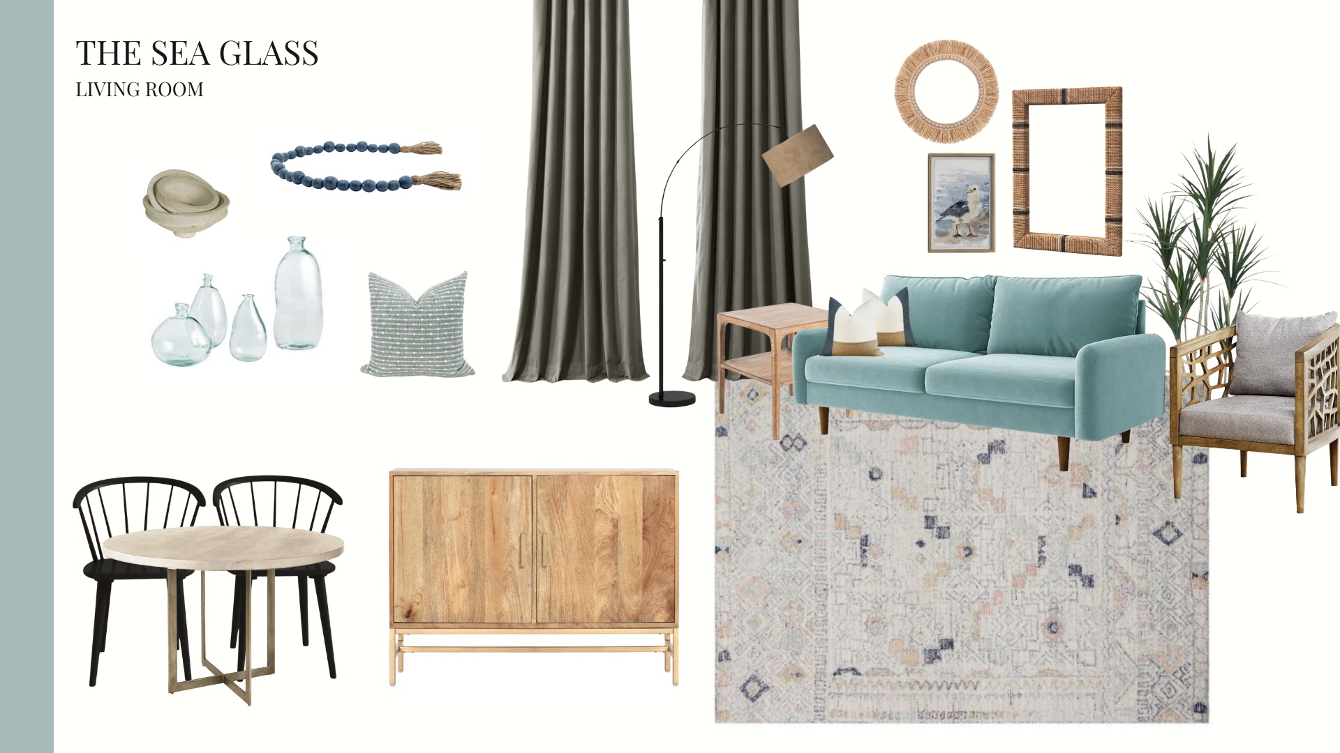
This was one schematic version of my living room board as I was going through the design, and as you can see on the next board and in the final photos, some things changed as the design progressed. Vision boards for me are working documents that change and evolve over time. This sometimes happens because things don't look or feel right with the design, or because different products are needed for the space from a budget or durability standpoint.
The board above was a little of both. It wasn't quite right as is, but that's the beauty of a board. You can move things around easily to decide if they work and if the space is balanced well. The black chairs above didn't feel right to me because there was no black balance in the room. By black balance, I just mean there was no black throughout the rest of the design thus far and so they felt a little heavy and weighted on that one side of the room.
Again, the beautiful thing about a vision board is that it can allow you to visualize the balance of your design in a room. If you're placing things roughly where they will be in orientation to one another, you can be confident that once you have these pieces in real life, they will work well in the space together too. To learn more about how to harness the power of vision boards to empower your every purchase decision for your rental, check out my Design Your BNB E-course here!
The final vision board before site visit...
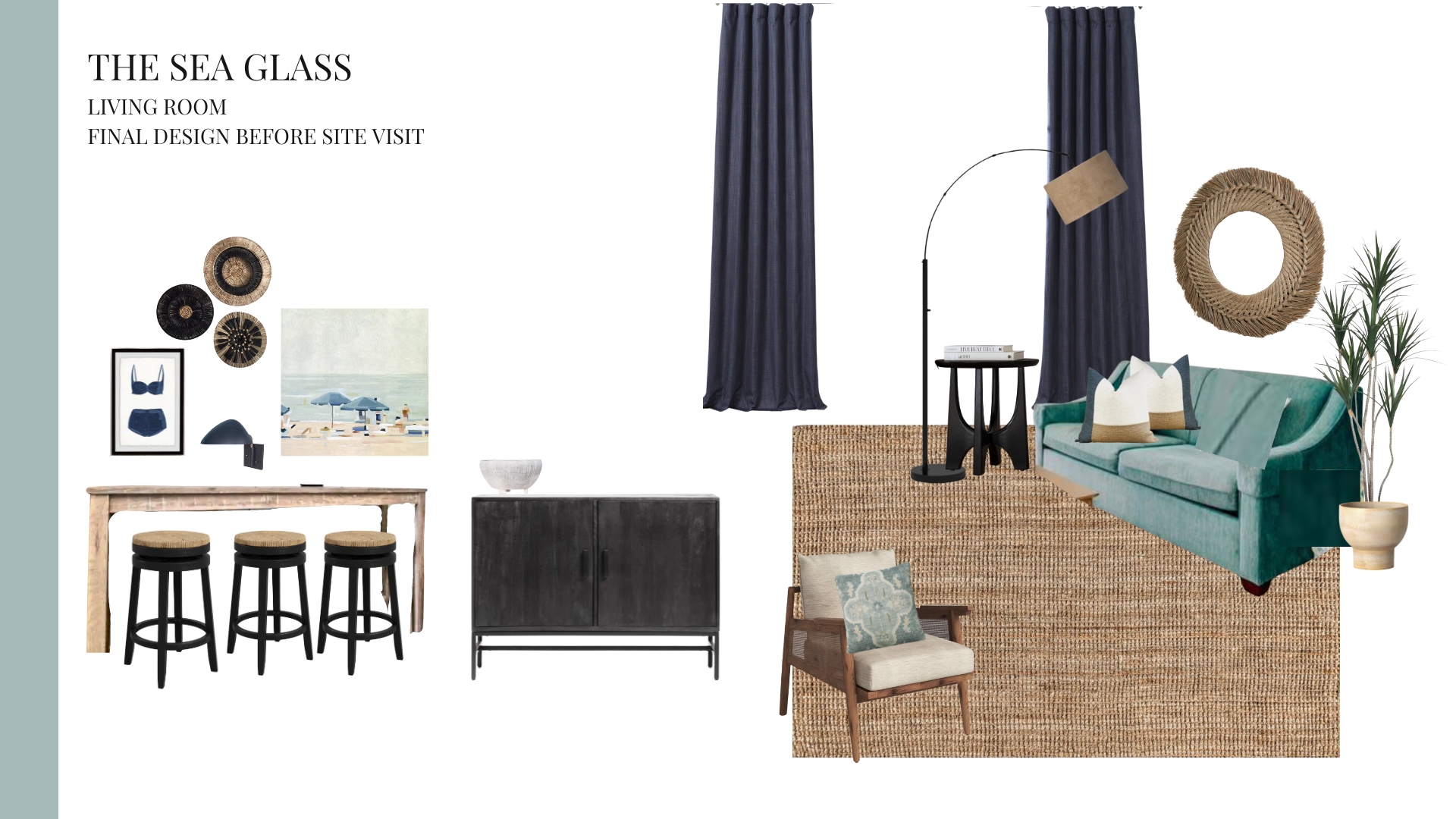
What you see above is the design plan as it stood before I traveled over the pond to South Carolina. Things inevitably change when you are designing for a space you've never seen in person and when you don't have dimensions or even conclusive photos.
The Mishaps in the Messy Middle
Here's a glimpse into the MESSY MIDDLE of this project as we revamped and staged it alongside 2 other properties in just a few days.
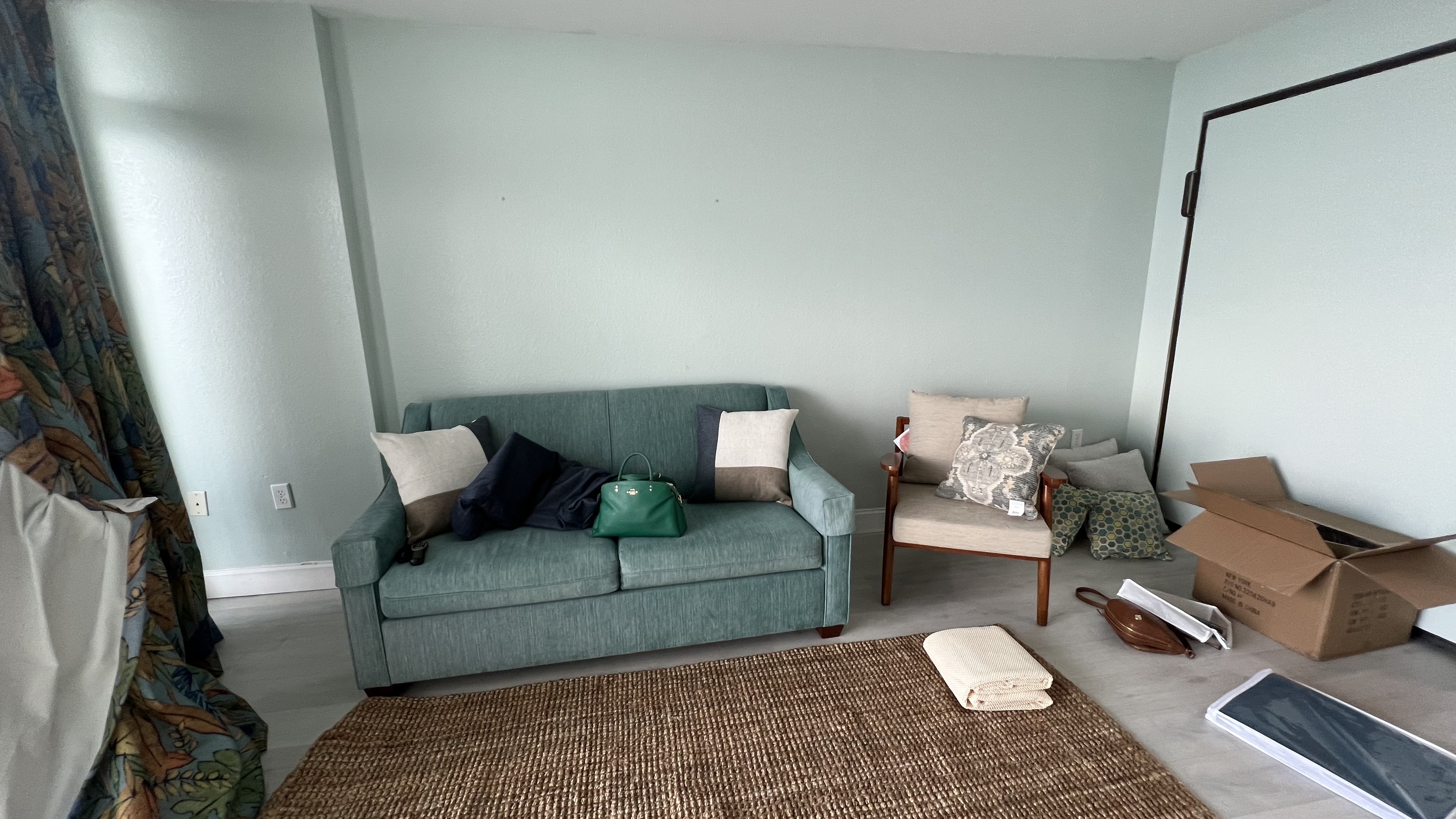
That wooden chair you see next to the sofa is what came in from Wayfair. The chair I ordered was NOT a red tone of wood, so that didn't work with the room or design at all. Also, the cane on the side was a different color than was shown on the website, so that chair had to go right back to Wayfair, and we searched for and found an excellent replacement at the local Homegoods.
It's whoopsies like this that crop up on a project, and this is why you MUST tune in to our full show when it debuts this summer. We share all of the pains of turning an existing rental design around in just a few days in a fun and hilarious format. We drove all over Myrtle Beach that week, our cars packed to the brim with products on our ultimate quest to Better These BNBs!
The final (final!) board and products we love...
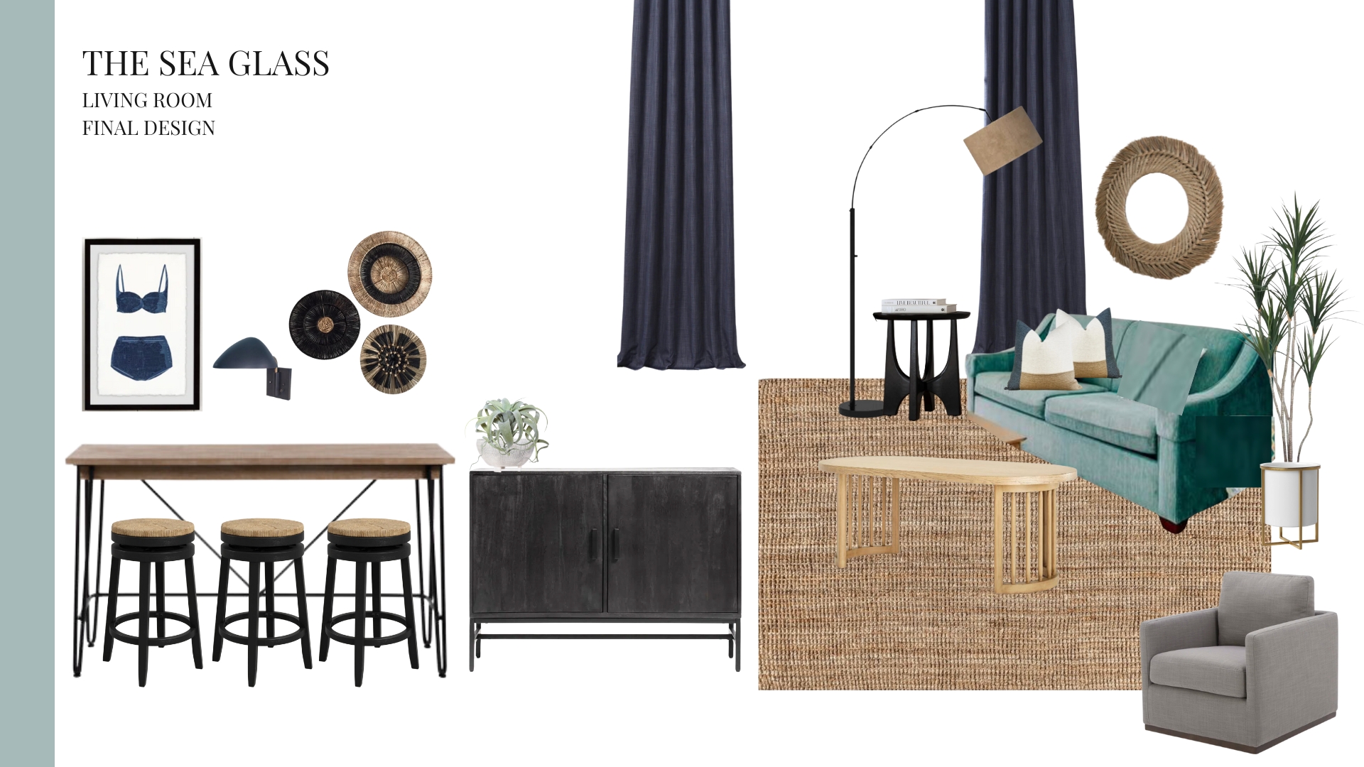


1. bikini art | 2. grass circular artwork | 3. jute mirror | 4. arc lamp | 5. end table | 6. curtains | 7. faux plant | 8. plant stand | 9. faux air plant | 10. throw pillows | 11. barstool | 12. tv stand/storage | 13. coffee table | 14. sisal rug
I can wholeheartedly recommend all of the products shown above from a quality, durability, and budget perspective.
You'll notice that Wayfair did some pretty heavy lifting among the products featured on this board. As usual, I experienced excellent customer service with them — I appreciate their willingness to do right by the customer for products that didn't come in as they looked on the screen, as was the case for a few of our purchases, like the armchair mentioned above!
I hope you enjoyed that little snapshot into my design process and the sneak peek of the finished result. Stay tuned as I'll be writing another blog explaining the bedroom design of this property next week!
And don't forget to stay tuned for our upcoming episodes diving into all of our many design debacles and how we handled each of them on a time crunch and on a budget!
Here is a shot of us with our Camera crew. These guys were the best, and have more footage of us freaking out over chair mishaps and curtain crises than they'll know what to do with. (Good luck editing, guys!)

Happy Hosting!


