Beach Property Makeover: Taking an Airbnb from Drab to FAB
Jan 26, 2024
This post includes affiliate links. If you make a purchase after clicking on a product in this article, I may earn a commission, without affecting the product's price for you. Thank you for supporting my small business! 💗
I had the pleasure of flying over to Myrtle Beach, South Carolina to makeover a few condo properties with the fabulous Stacey St. John. (Read the first two makeover blogs HERE and HERE.)
Check out the video link above to see this condo come together, and then keep reading this blog to learn how I planned the design in advance, and made on the fly decisions while there to change some things up, and ultimately pull this condo together with some pretty fab before and afters!
WATCH THE VIDEO HERE👇
In this post, I'm going to tell you about Sheila's beach property makeover, a property we called Coastal Blue.
As I mentioned in my first post about the Myrtle Beach trip, I did a lot of planning work in advance with vision boards long before I hopped the pond and arrived in the U.S. (If you're new here, I am a Tennessee girl raising a family in Cambridge, England.)
Sheila's property needed a kitchen renovation as well as a decor and furniture makeover. We helped her to facilitate the right contractors to hire, the best kitchen finish options, and paint colors so that all of that was done before we arrived. (Whew!)
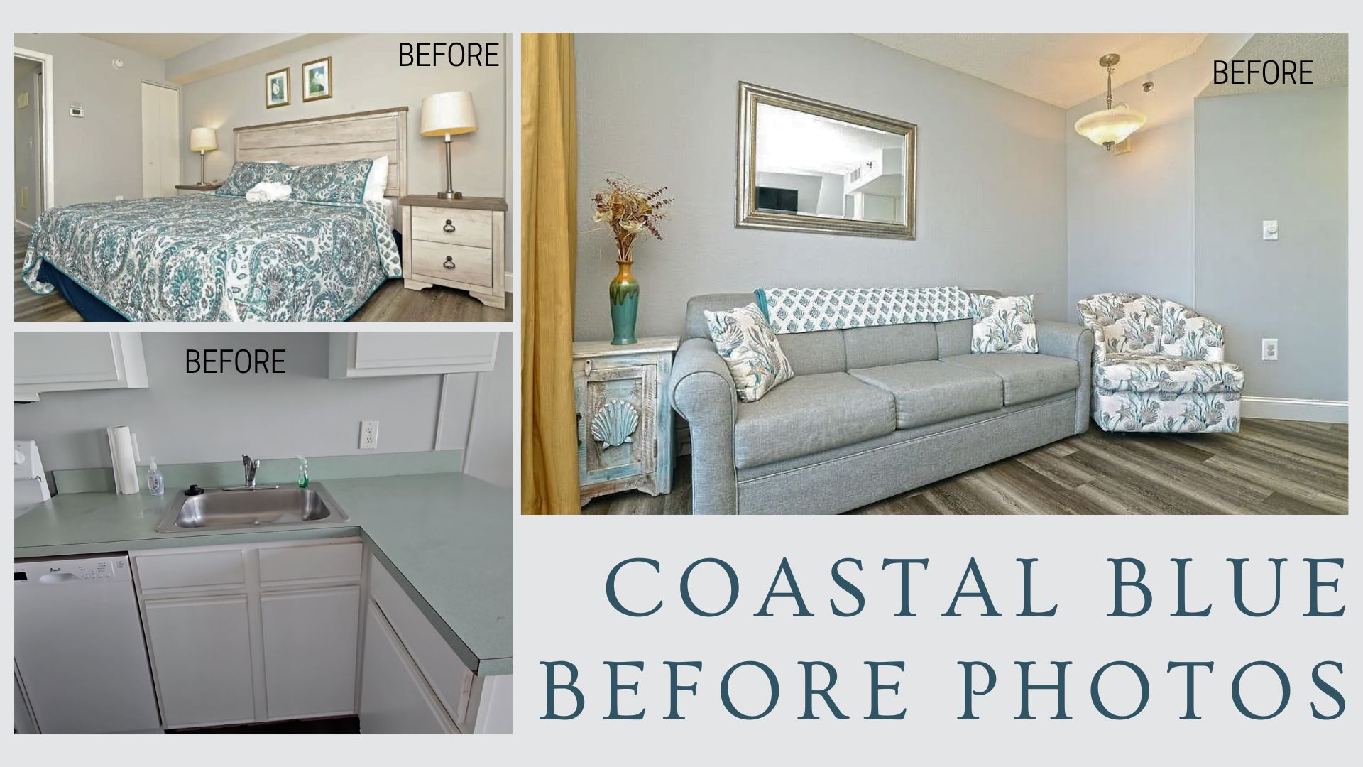
Living Room Design
So, let's dive into the living room design first.
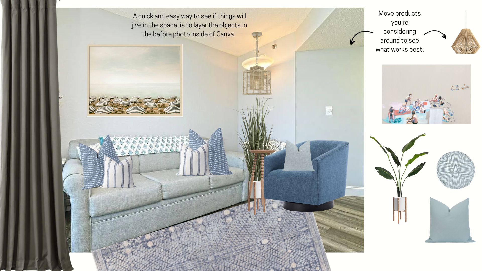
Here is my initial draft of the living room vision board. (These things start a hot mess, so this is a slightly cleaned-up version of the initial board. The initial board wouldn't be suitable for public internet consumption. 🙃) 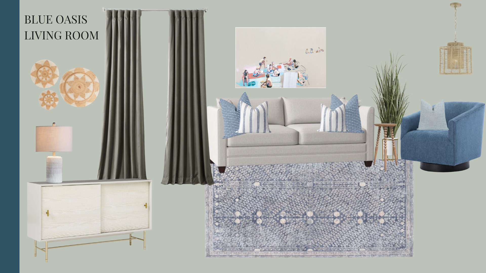
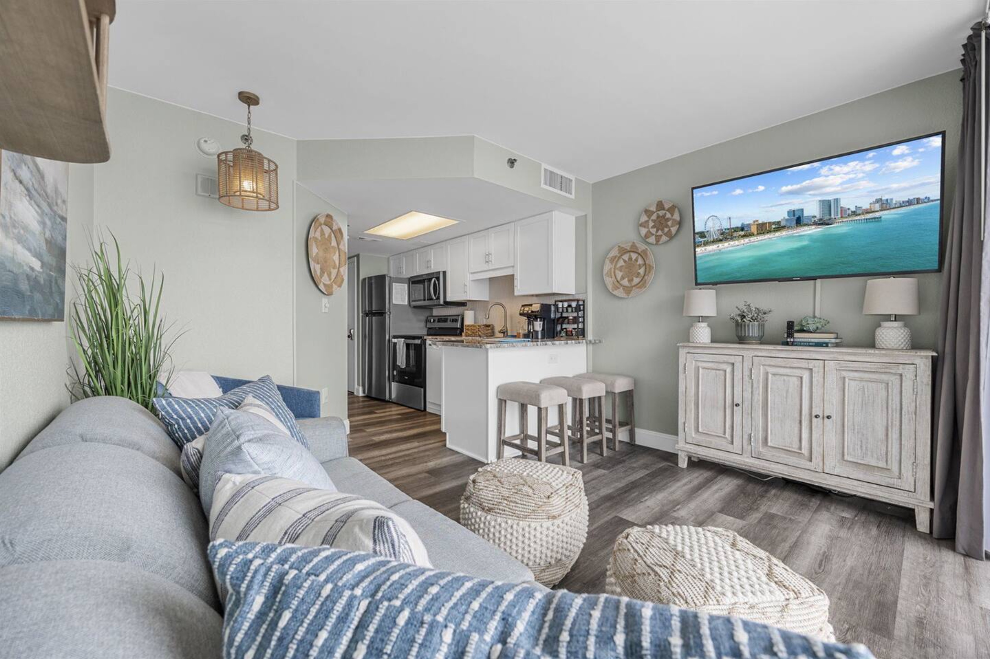
Owner Sheila wanted us to keep her sleeper sofa as it was in pretty good shape and those are a pretty penny to replace. That was easy enough given it was a neutral color. My design anchors for this room were the gorgeous rug, the blue swivel chair, and those drop-dead gorgeous handmade Etsy pillows.
Now, let's talk about the rug. We ended up having to send it back because although it looked perfect on the screen with the sofa, in person the colors didn't go together at all. The rug had a very cool color temperature and the sofa was a warm color temperature, so they just were not jiving together at all. (I want to point out, that in the video this is not obvious, but in person, they looked awful together.)
I shed a few tears then we packed that baby up and decided to just skip the rug altogether. This condo has a teeny weeny living room and the rug was butting up very close to the barstools anyway. So, we opted for some cool poufs from Kirklands instead.
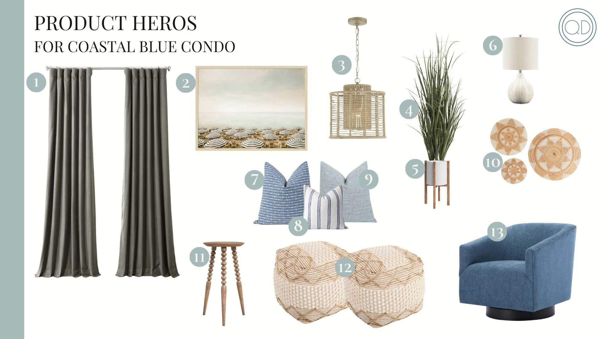
1. | 2. | 3. | 4. | 5. | 6. | 7. | 8. | 9. | 10. | 11. | 12. | 13.
The MAJOR winner of this space was the curtains from Half Priced Drapes. These were custom-ordered, made to fit the glass doors. They ended up being the PERFECT length and width, and I was so pleased with the quality for the price. They were lined with a thick white cotton fabric, and they drape beautifully with the perfect fabric thickness. I would HIGHLY recommend you check out their site if you're in need of curtains. 👉 Half Priced Drapes. 👈
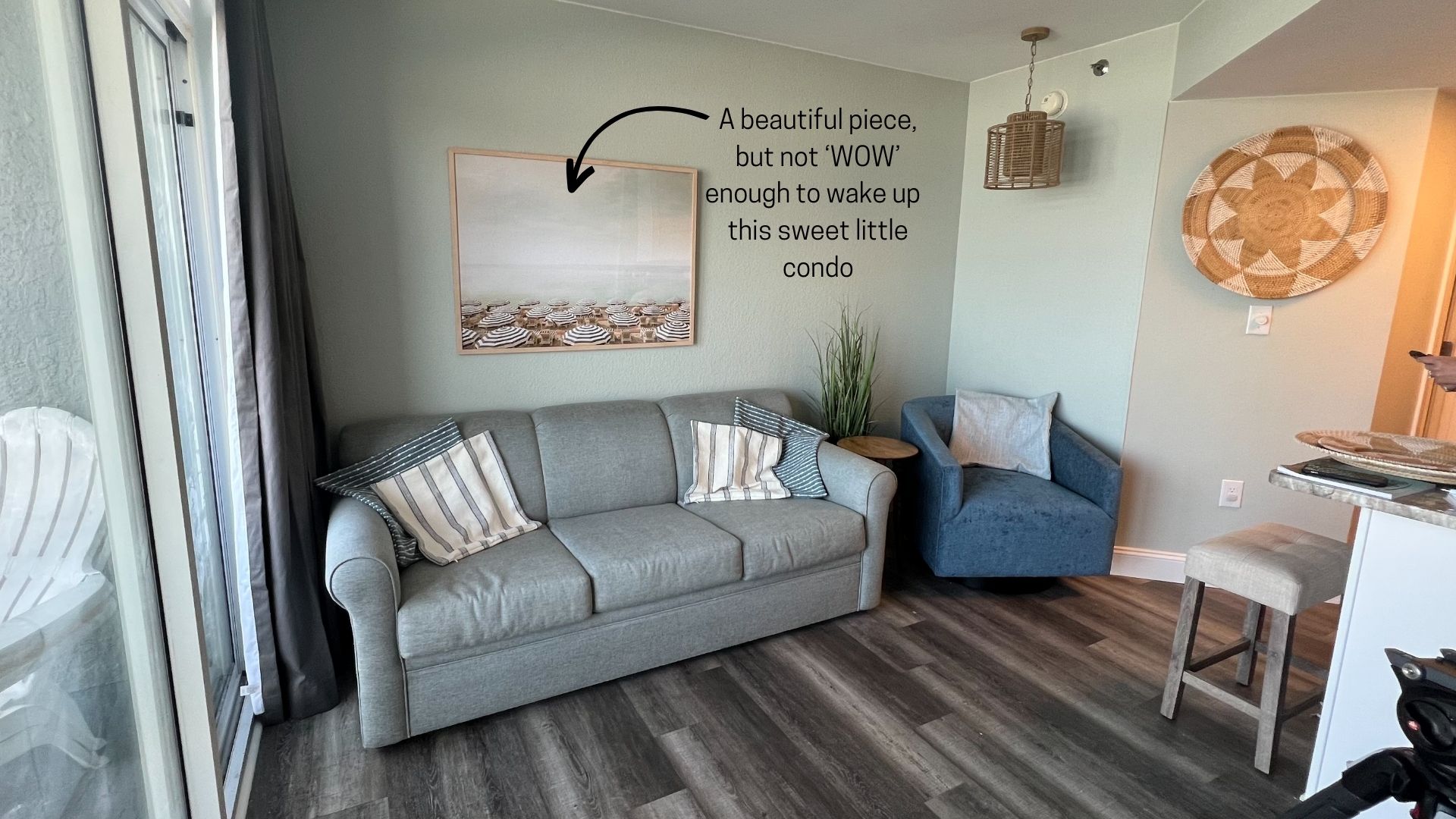
I also want to point out the art switch behind the sofa which we didn't really address in the video. The piece I specified from Target was very pretty, and I loved it in person. But somehow it just didn't wow me enough in the room. The colors were very muted and we needed more interest on that wall to make the space really interesting and special. (Because of the texture of the wall and humidity, we couldn't do wallpaper on the walls, which would have been my preference to make the space feel WOW!)
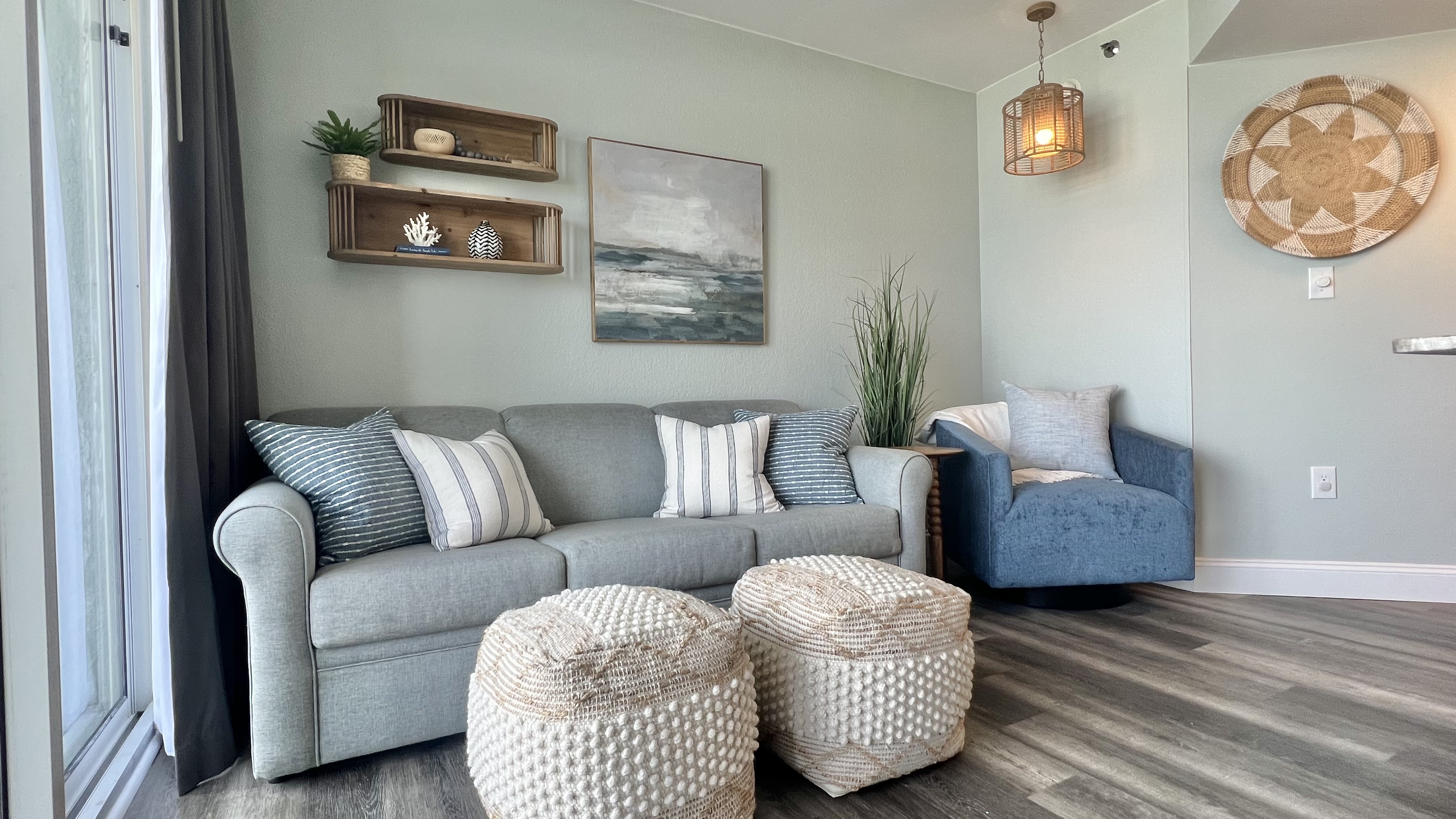
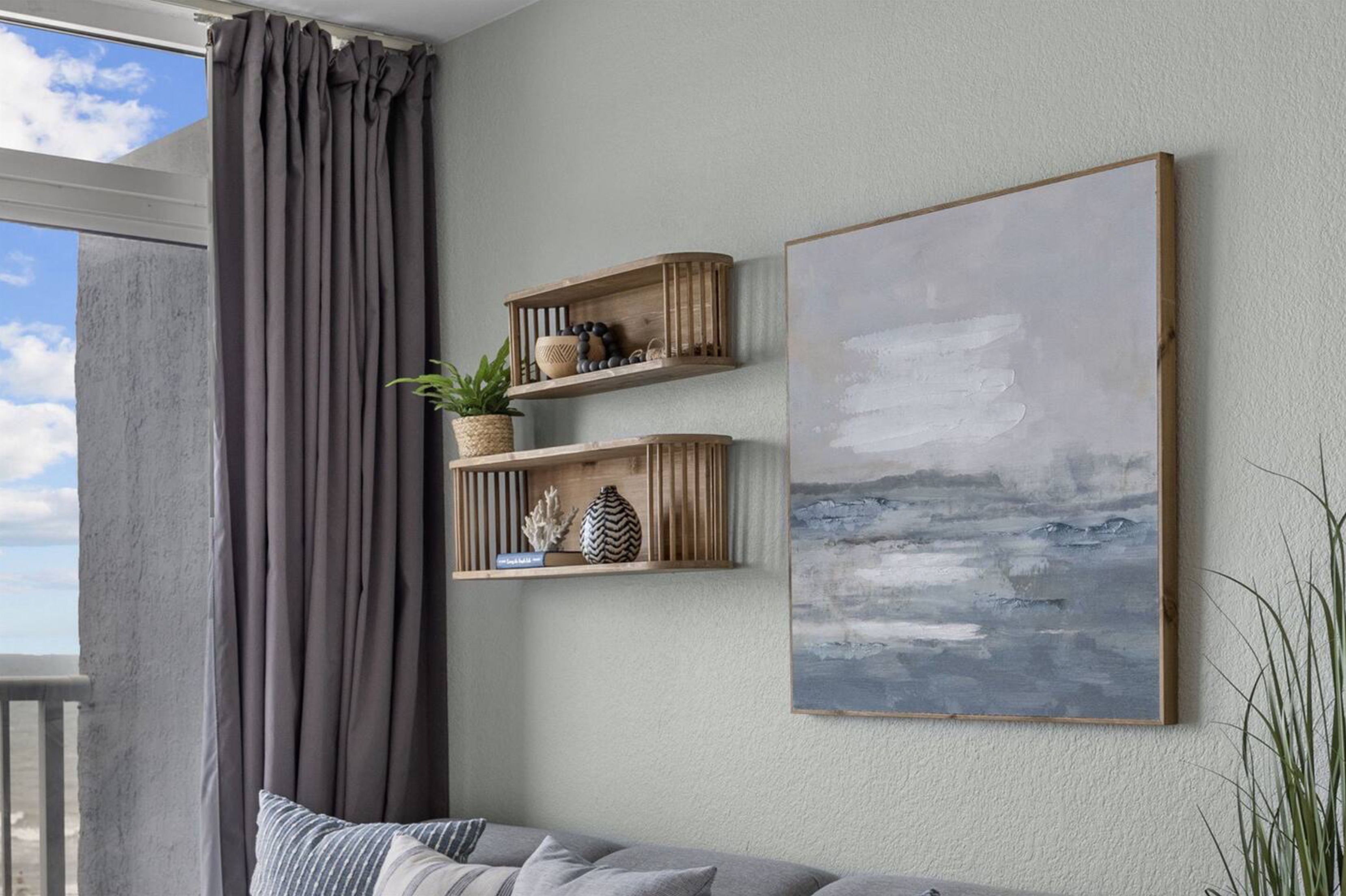
What we ended up with were the two adorable shelves from Kirkland's and a pretty ocean painting from Hobby Lobby. It filled out the space better and worked beautifully. For the shelves, I didn't want to fill them with too much decor, but instead add just enough for interest, and still allow guests to put the tv remote or their own things up there. This decor was found at Homegoods, Target, and Goodwill.
 above photography: Next Door Photos
 above photography: Next Door Photos
 above photography: Next Door Photos
One thing I love to do in Canva is layer objects on top of an actual photo of a space. It's the quickest and easiest way to see if what you're planning will work. This sometimes looks messy, but it is a great design hack! And that's what matters. (see below.)
If you want to learn more about how to use vision boards for confidence with your decor and furniture purchases, check out my full Design Your BNB Course here. 👈
Bedroom Design
Okay, now let's move to the bedroom. This is the initial vision board.
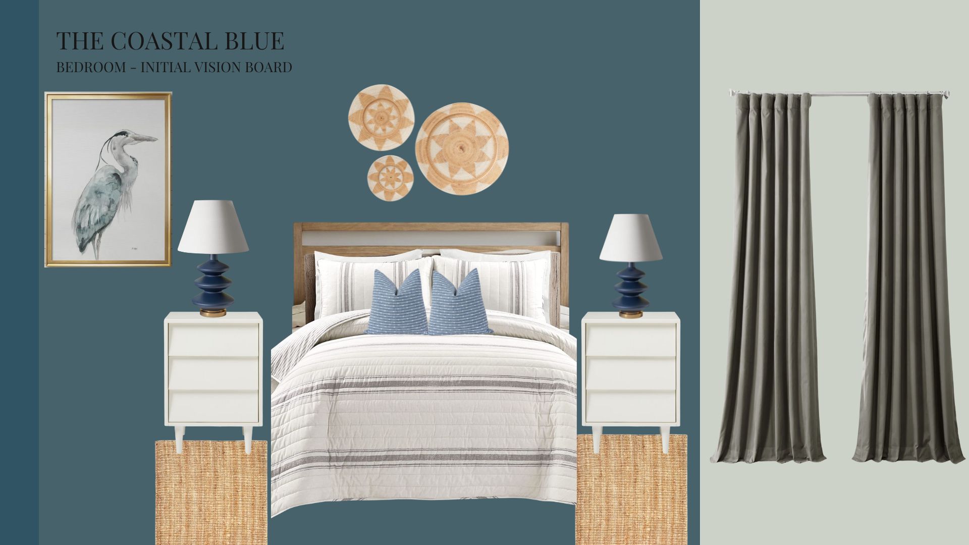
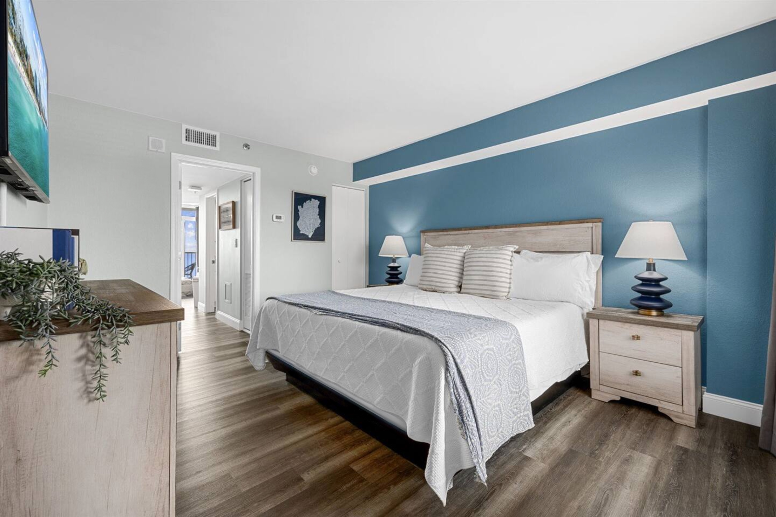
I chose a bold blue color for the headboard wall called St. Bart's by Sherwin Williams. (The rest of the walls in the condo are Sherwin Williams Sea Salt.) Those big blue bedside lamps were the stars of this room!
I selected this round basket art to go in the bedroom, but we ended up using them in the living room instead because the color and size didn't look quite right above the bed. (As I mentioned in the previous posts, we were working with owners who didn't live local to these projects so we weren't able to get proper measurements or in some cases current photos of the spaces before heading to South Carolina ourselves.)
In the bedroom, our Heron art came in damaged from Wayfair. This happens. When you're shipping lots of products, the probability is high that some things will arrive damaged. The reason I love Wayfair and its family of brands is that they always handle these damages quickly and easily. They refunded us without needing to ship the piece back, and we found a beautiful navy blue coral art print (similar to this) at the local Homegoods.
 above photography: Next Door Photos
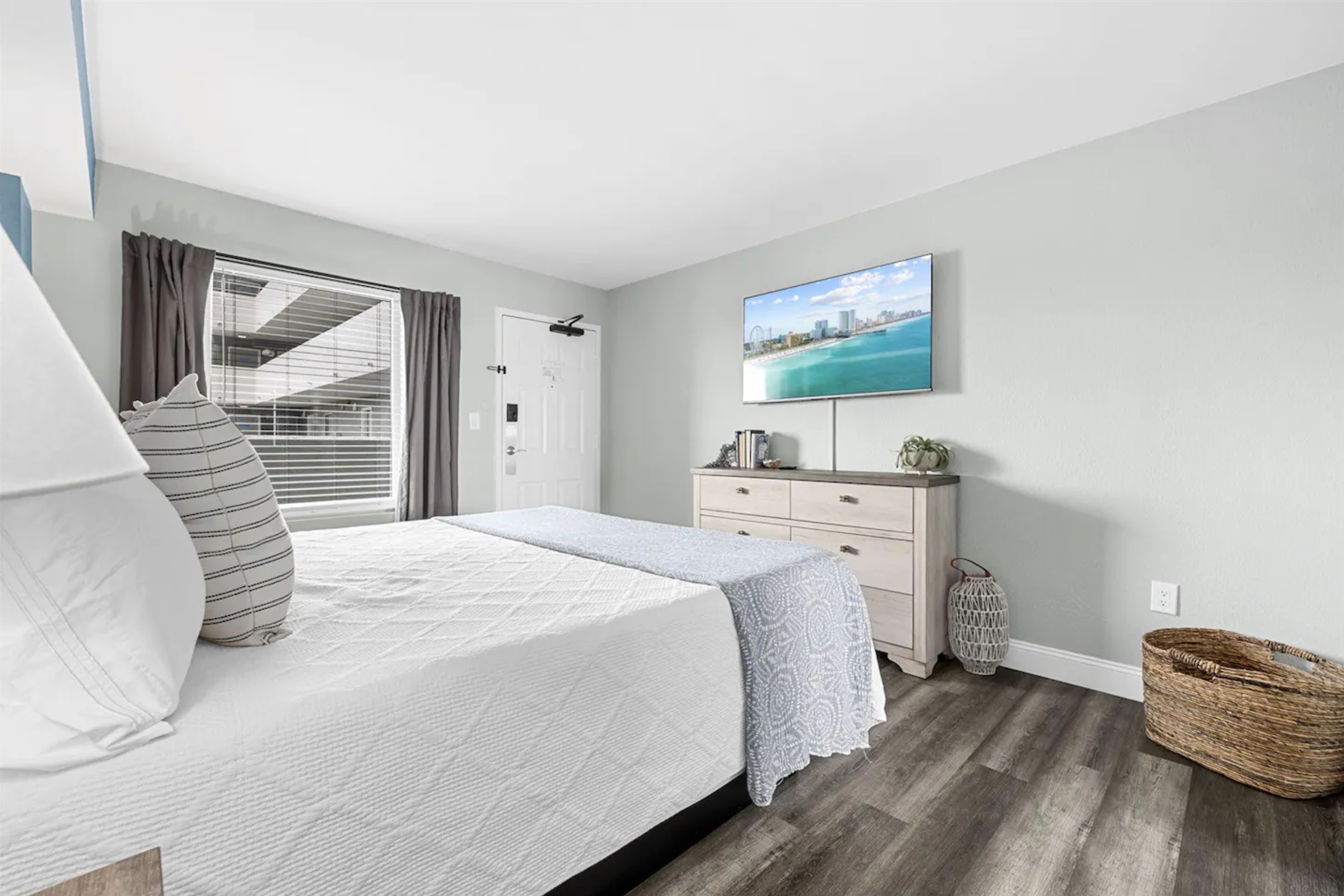 above photography: Next Door Photos
We had initially planned to replace the end tables, but we ended up keeping all of the bedroom furniture at the owner's request so that we could stay on budget, which is always a good idea.
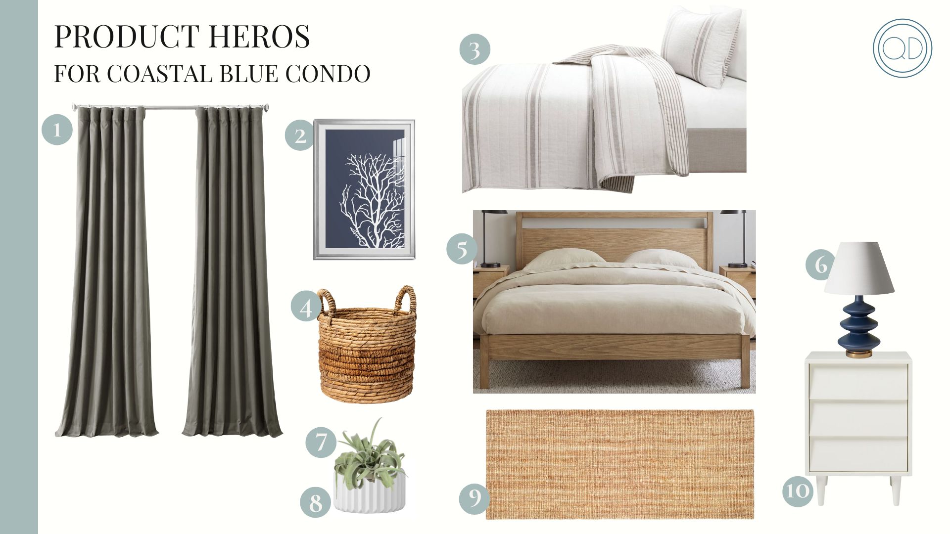
1. | 2. | 3. | 4. | 5. | 6. | 7. | 8. | 9. | 10.
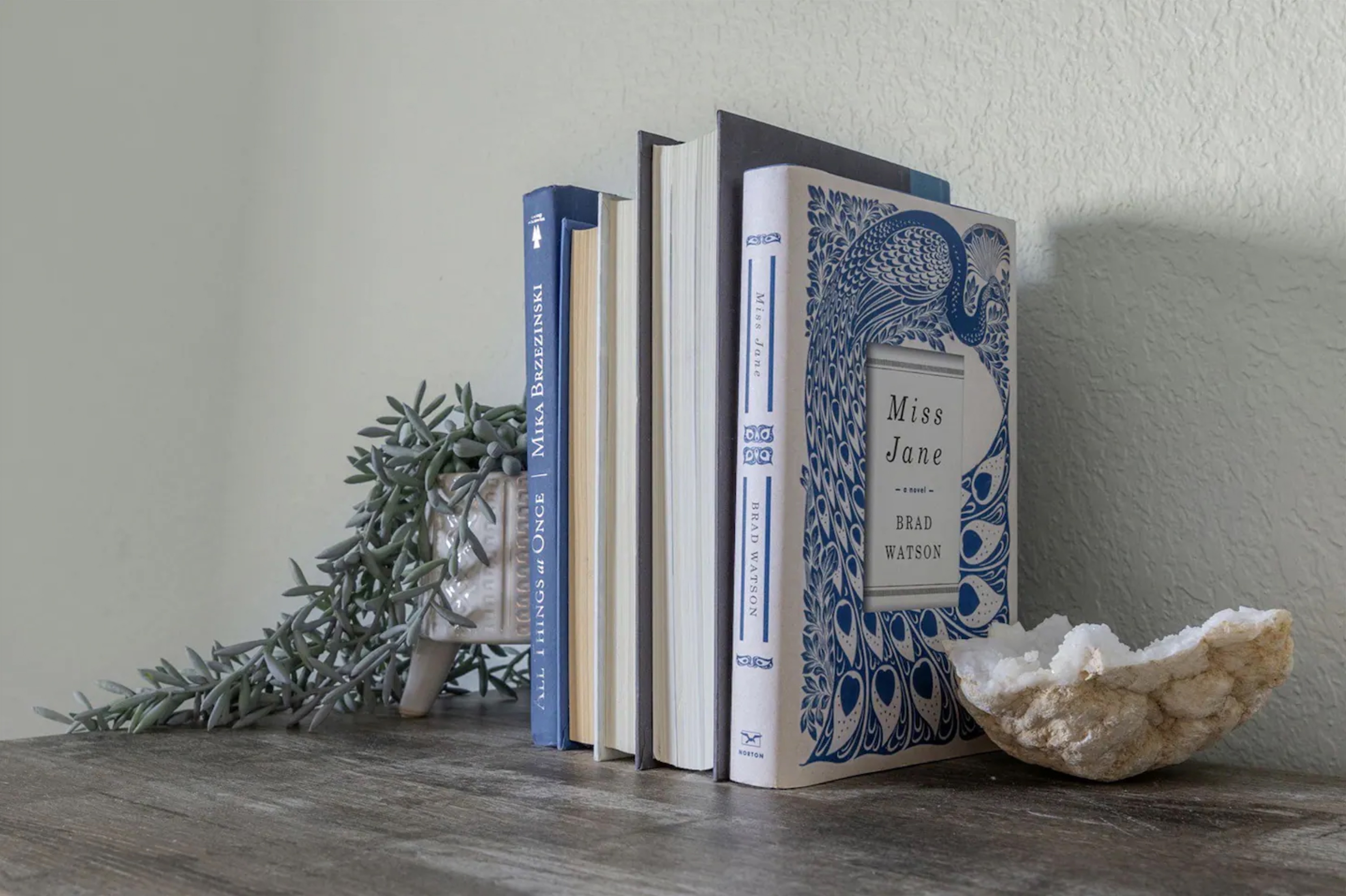
Want to know my favorite staging tip? Books! Want to know where to score cheap hardback books? GOODWILL! (Or any local thrift store.)
I scored this gorgeous stack of books at Goodwill for $2 each.
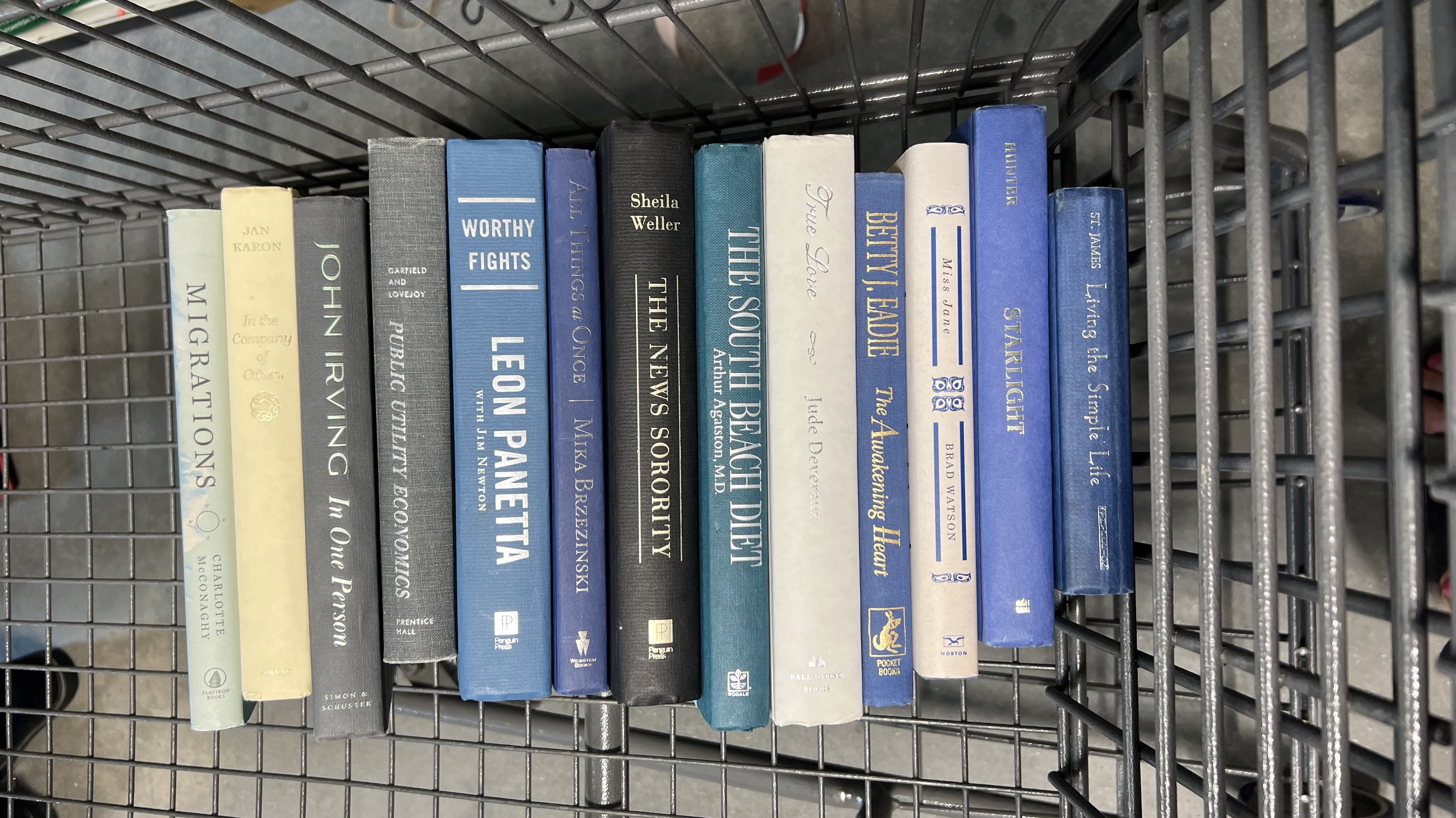
I popped into Goodwill for an hour one day and rummaged around the book section collecting black/grey, white, blue, and green hardback books. The key is to take a peek under the ugly removable cover to see what color and quality the hardback cover is, and if it fits with your overall color scheme. I bought all of these and more to use as I staged all 3 properties for the week. $2 each, people! At that price, you just buy more than you think you'll need so you have enough. If you don't use them all, just donate them right back. Everybody wins.
Nothing is more fun than this to me! Upcycling, saving money, and adding character and interest to the space at the same time. YES!
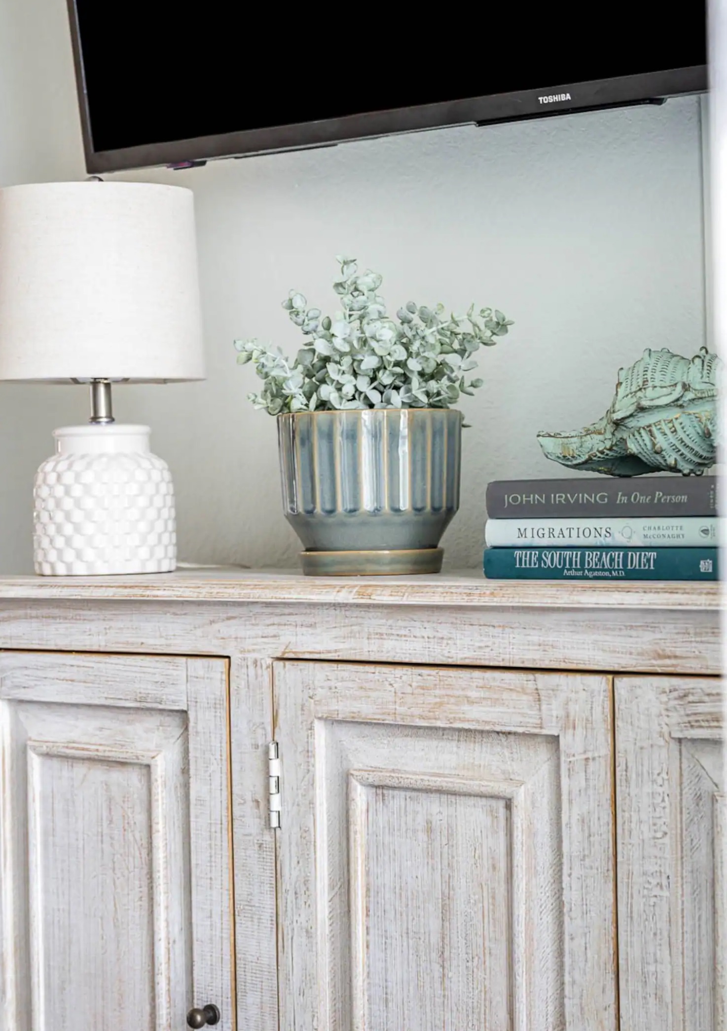 above photography: Next Door Photos
 above photography: Next Door Photos
I hope you enjoyed this little recap of Sheila's gorgeous beach property!
Click this link to book her place or to see all of the photos of the beautifully redecorated rental!
Happy hosting to you, my friend!
![]()


